From Discovering KKOOM to Pitching Projects
In 2021, Will Landers and I met during our first year as U.S. Fulbright Korea English Teaching Assistants (ETAs). During orientation, Grace Lee, KKOOM’s former Executive Director, shared a presentation about KKOOM’s work. As a Korean adoptee, I was instantly drawn to the organization’s mission and eager to find ways to get involved.
With COVID-19 still at its peak, in-person events weren’t possible. Instead, my first contribution to KKOOM focused on digital work. From designing the Dream Big Interview Series to sharing website and communications recommendations. Prior to Fulbright, I had been working in New York City as a UX/UI designer at a social impact design firm, collaborating with numerous nonprofits and think tanks. I was excited to support KKOOM with these same skills.
From the beginning, strengthening KKOOM’s communication channels was really important to me. For nonprofits, a strong brand presence, clear communication strategy, and thoughtful user experience are essential for building awareness, trust, and long-term donor support. A few years later, Will and I had the opportunity to pitch a full website redesign to KKOOM, and I was thrilled to finally bring this goal to life.
Why a Website Redesign was Needed
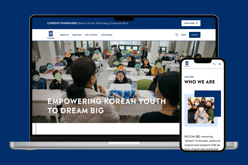
When we began the project, KKOOM’s website contained outdated information and imagery that no longer reflected the organization’s identity, especially following a rebrand and logo redesign a few years prior.
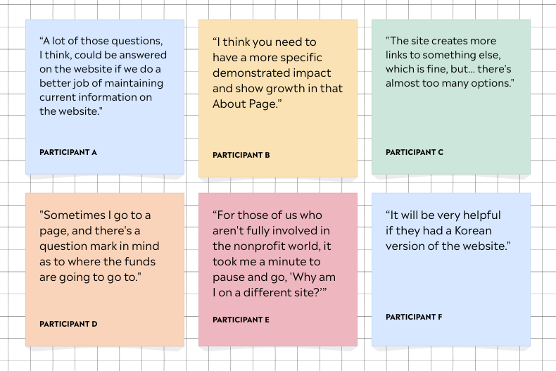
Through conversations with KKOOM staff, Board members, and stakeholders, we learned that visitors often struggled to find clear, up-to-date information, especially around how to get involved. As a result, staff frequently received basic inquiries that should have been easily answered on the website, creating an avoidable strain on a small team with limited capacity. One of our primary goals was to help supporters quickly find what they needed while reducing follow-up inquiries.
We also discovered that the website did not clearly communicate KKOOM’s program areas and that donors found the donation process confusing. The previous flow required users to navigate from the website to an external platform without clear context, which made giving feel more difficult than necessary. Improving this experience was critical to supporting KKOOM’s fundraising efforts.
Finally, stakeholders consistently emphasized storytelling as the heart of KKOOM’s work. While storytelling has always been central to the organization, the website lacked a clear, intuitive structure to make stories easy to find, read, and share. Strengthening this structure was essential to helping supporters understand impact and stay connected to KKOOM’s mission.
How We Approached the Redesign
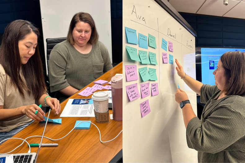
We began by listening to KKOOM’s stakeholders and community. During interviews with a diverse group of donors, volunteers, and partners, we gathered a list of places where people felt confused with the current website and the ways in which they engaged with the content. These interviews helped us identify donations, blogs, and involvement, as focus areas to examine for the redesign.
With these comments in mind, we assessed KKOOM’s current website to understand the ways that it facilitated important tasks. In line with the interviews, we found that the website’s “donate” buttons led to different pages and that the blog lacked robust search and filter options, among other opportunities for improvement.
At the same time, we sought inspiration from the websites of other nonprofits. Websites like those of Yana Ministry and Charity Water showed us a way to align all of KKOOM’s donation pathways onto a single page. Meanwhile, websites like those of the Ford Foundation and Malala Fund demonstrated that we could empower readers to find what they are looking for without being overwhelmed by choices. The simplicity and call to action in these websites echoed the needs expressed in our interviews.
Building a Clearer, More Trustworthy Experience
Financial Transparency
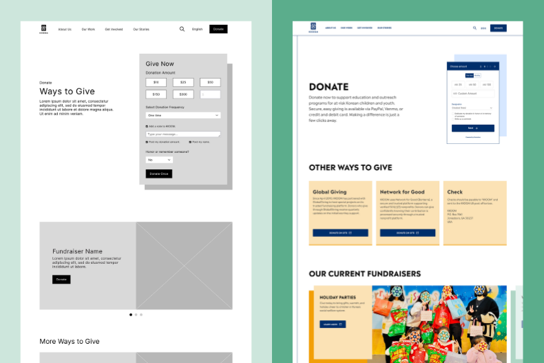
Interviews showed us that KKOOM’s audience wants to see evidence that an organization is trustworthy. Other nonprofits have visually illustrated their budgets, linked tax forms, and shown logos of their partners. Inspired by these examples, we created the Our Financials page to transparently share how KKOOM uses its funds. We also ensured that references to partner organizations and donation processors like GlobalGiving, Network for Good, and DonorBox are visible on the Donate page. With transparency for finances and visibility for partners, KKOOM can strengthen trust with its audience.
Clearer Donation Pathways
Simplifying donations presented another opportunity to build trust. Our interviews and observations showed that the original website split donation methods across multiple pages and to other websites. This frustrated community members, rather than building confidence. In response, we combined all donation options into one page and enabled donations directly on the site. Additionally, we added a new icon to show when any link leads to a different website. From now on, donations will be simple and clear.
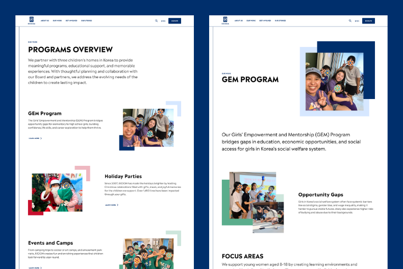
Clarity and Confidence Around Program Areas
On the previous site, the “Our Work” page lacked clear descriptions of each program area. Clicking a program redirected users to the “Our Stories” page, which often caused confusion. To improve clarity, we created both a program overview page and dedicated pages for each individual program. These individual program pages allow users to understand each program in depth before exploring related stories.
In addition, we also updated the filtering system on the “Our Stories” page, making it easier to search, sort, and filter content as KKOOM’s blog continues to grow. Rather than replacing program information, stories now complement the program pages by deepening understanding and engagement.
Developing Content for a Global Community
While KKOOM is U.S.-based, its work happens almost entirely in Korea. The redesign expanded the site from English-only to a bilingual, cross-cultural experience accessible to English-speaking, Korean, and international audiences.
While adding Korean translations to the website was an important first step, we knew that direct translations do not always carry the same meaning across languages. Koreans often use Konglish, a mix of Korean and English that shifts meaning, pronunciation, or usage.
For example, a literal translation of “holiday party” into Korean can feel vague or unclear, whereas “Christmas party” communicates the intent more clearly in a Korean context. To avoid confusion, we carefully chose between direct translations and Konglish terms, collaborating with native and bilingual Korean speakers to translate and refine all content.
In some cases, we also needed to compromise between different Korean and English language expectations. The Frequently Asked Questions page was originally named “FAQ.” This short title was intuitive for Americans, but it confused the Korean audience. One solution, offered by a Korean website tester, was the label, “Q&A.” However, this term could imply a different meaning to the U.S. audience. By spelling out “Frequently Asked Questions,” we found that both audiences could find and understand the page.
Honoring Korean Heritage Through Design
Drawing from Cultural Inspiration
As a nonprofit that works directly with children’s homes in South Korea, it was important that KKOOM’s website reflect not only clarity and trust, but also culture and identity. KKOOM already had a strong visual foundation in place, with a refreshed logo and brand redesign completed by Amy Fortunato several years ago.
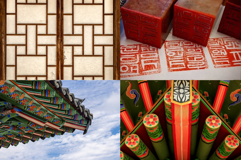
As we expanded the existing visual language, we looked to traditional Korean design elements for inspiration, particularly hanok (traditional Korean homes), architectural patterns, and dojang (Korean identity seals used for important documents and contracts).
Drawing from hanok architecture, we incorporated strong parallel and perpendicular lines throughout the site to create a sense of rhythm, balance, and harmony. We also introduced geometric shapes inspired by the layered and overlapping patterns found in Korean temple architecture and hanok window frames. We wanted the window motif to symbolize hope, possibility, and new beginnings, values that closely align with KKOOM’s mission.
Much like a dojang, we incorporated the thoughtful use of positive and negative space. Some elements remain close together, while other elements give each other space and breathing room on the page. The dojang to us symbolizes identity, confidence, and belonging. This approach reflects both personal identity and the importance of building a strong sense of self and belonging for the children KKOOM serves.
Modernizing a Traditional Color Palette
Color also played an important role in the redesign. We used KKOOM’s two-tone color system that draws inspiration from traditional Korean architectural and temple palettes. The combination of light and dark and warm and cool tones creates a sense of balance and cohesion across the site. The only small update we made was changing the previous blue-gray to a brighter light blue, allowing the graphics to feel more vibrant and helping images stand out more clearly.
Using Design to Protect the Children KKOOM Serves
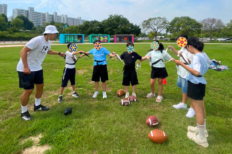
Finally, protecting the privacy of the children we serve was a critical consideration. To do this, we thoughtfully cover the faces of older children in photos. These overlays are inspired by sumaksae (수막새), or the decorative end tiles found on traditional Korean roofs. These fun overlays not only protect the children KKOOM supports, but also allow the images to feel cohesive and unified across the site.
Final Reflections
As we reflect on the journey, from our first introductions to KKOOM to the launch of a fully redesigned website, we couldn’t be more grateful and proud. Wrapping up this major milestone for KKOOM, has been a deeply meaningful one for the both of us.
Will and I entered this project with a clear goal: to improve how information on the site is organized and to make the donation process more user-friendly and intuitive. Through community feedback, Board collaboration, and user testing we are confident have made it easier for supporters to engage in KKOOM’s work.
Looking forward, we’re especially excited to see how KKOOM’s community will engage with the site, and how updates will improve awareness, share stories, improve donation streams, and strengthen outreach for the organization.
Collaborating on this project has been a powerful reminder on how far KKOOM has come and why its mission matters. We invite you to explore the new website and share your thoughts and feedback with us. Thank you for being part of KKOOM’s journey! We’re grateful for your continued support and excited for what lies ahead.
Interested in learning more about this project? Want to Nerd Out on Design?
In the upcoming months, we will be uploading our own versions of KKOOM’s website redesign case study to our personal portfolios.
Check it out our portfolio websites below: